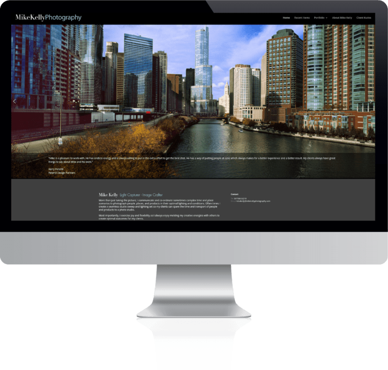
Mike Kelly offers professional photography in Chicago, Illinois. In 2019 he started running into some problems trying to update his WordPress website. Mike called is brother, our very own Max Kelly, for some assistance.
Objectives & Challenges
The primary objectives with this website were technical. Mike wanted to keep the basic design and layout but address the issues of performance and usability. This presented two challenges. First, after looking under the hood we noticed that there were a lot of troubling plugins. Some were needless, outdated, or no longer supported. There was also a robust yet temperamental theme. A few of the plugins were directly tied into the website design, thus a complete breakdown and rebuild was necessary.
The second issue was the volume of data. As a photographer, Mike’s portfolio includes lots of heavy images. This results in more difficult migrations and staging websites. Using a combination of plugins and good ol’ fashioned sweat, everything was set up with minimal down time.
Other than that, this was mostly a straight forward website design re-creation. We Cataloged the design elements and site map and set out to build replica of the website.
Updates and Changes
In addition, we suggested and made several changes to the layout and design:
- Header sections on pages
- Image gallery layout
- Blog index page layout
- Mobility
Image Galleries

As a veteran in the field Mike has a large collection of photography. These images come in different sizes and dimensions. We chose not to use a standard gallery layout. They often present images as square thumbnails that crop the image to fit a square or rectangle. Instead, we implement what is called a masonry gallery. This dynamically generates the gallery keeping the image’s aspect ratio. As a result, the Images fit together like “bricks” which is more visually pleasing.
Mobility
As is common today, the original website was built before mobile browsing was a thing. Thus, the website did not scale to fit mobile devices. We tested and adjusted many parts of the website including sliders, layout, and font sizes. As a result, the website fits beautifully on phones and tablets as well as desktops.
Blog Index
Mike started posting recent jobs as blogs. He noticed that the index page for blog posts was not laying out nicely. So, we configured the blog index to display a pleasant list of blog posts.


