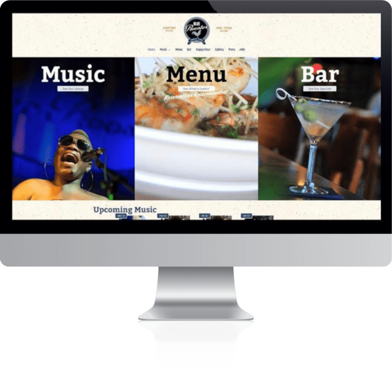
Blue Rooster’s slogan is, “Comfort Food & Feel Good Music”. Focusing on music and food rooted in a Southern culture, they deliver on that slogan. Everything they do draws from a rich Southern culture while putting a progressive twist on it: Their roadhouse-chic atmosphere echoes a rustic, mid-century juke joint that is comfortable and welcoming to everyone; Their food and bar menu is undeniably Southern (catfish, fried green tomatoes, mint julep) but always adds a new twist; Their music performances focus on blues, gospel, Americana, and jazz. It is from these characteristics that we drew our inspiration for the 2019 redesign of their website.
Objectives & Challenges
The primary goals for this project, aside from a fresh design facelift, was enhanced mobility and refined user focus. Each of these goals aimed to direct the visitor to 3 of the most important aspects of the business: the food menu, the bar menu, and, of course, the music lineup. Thus, the design focuses on providing unambiguous options from the get-go: 3 tastefully animated boxes at the top of the home page, one for each Music, Food, and Bar. These boxes, resting under the ever-present navigation, each have a link to the respective pages. The rest of the home page provides rows of subsequent highlighted content topics that are popular among visitors. Each non-home page provides a common yet attractive format of a bold header image with the page title and brief description over top.
Project Components & Highlights
- Website Design & Layout
- Responsive, Mobile Design
- Custom Photography
- Custom Menu Design
- Simplified Print & Web Menu Management
- Calendar of Events
- Copy Development
Mobility Layout
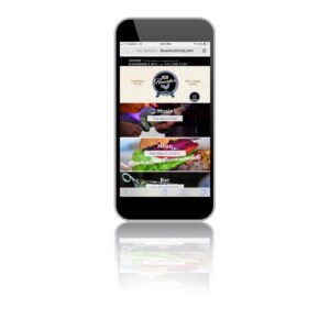
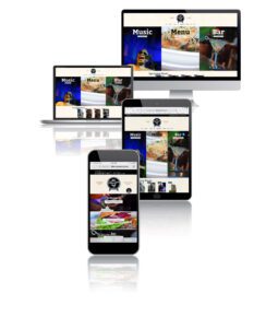
The original website had been built before the widespread use of tablets and mobile devices, thus the design and layout did not scale to accommodate such devices. The entire site would just shrink to fit on a phone: not good for on-the-go readability. First, we implement standard mobile break point stacking. This breaks content into stackable boxes that scroll so font and content size stays readable. We also culled and changed content based on the device that was being used. This way, mobile visitors wouldn’t be weighed down by information that was likely to be less important to a mobile viewer.
Simplified Print & Web Menu Management
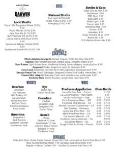
We are particularly proud of something we’ve never done before and something you don’t see very often. We have created 2 sets of layouts for the client’s menu web pages: one set for the web and one for print. Menus, I’m sure all restaurateurs will agree, are a royal pain in the ass. Creating a printed menu in the first place is typically a logistical nightmare. You have to reconcile page size, margins, lots of copy, readable font size, images, etc. Add to that creating another menu for your website and then maintaining both is a time drain and a loathed task. We’ve simplified that for Blue Rooster. Now, all the manager has to do is update a single menu: their website menu. After updating the online menu, the manager views the menu web page and, using the built in print functions of their web browser/computer, they print the web page menu on paper or export to pdf. Our code for the PRINT version strips away all extraneous images and unneeded sections of the web page and re-orients the remaining copy and content to fit on a 8.5 inch by 11 inch piece of paper. From there, they can either print the menu on their own printer or convert it to a pdf and send it off to a professional printer.
